Get Paid Upfront. Contextual Discovery for Invoice Advances
67% of QuickBooks customers wait 30 to 60 days to get paid for work they've already done. That waiting period stalls hiring, delays inventory orders, and creates the kind of cash flow anxiety that keeps small business owners up at night. QuickBooks had built a product to solve this: Get Paid Upfront, an invoice advance that pays you the day you send the bill.
The product existed. The design challenge was weaving it into an invoicing experience that millions of customers had built years of muscle memory around, without it feeling like an ad.
Small businesses can't grow when they're waiting to get paid
of QuickBooks customers have to wait NET terms or longer to get paid on the work they do, stalling business growth and creating cash flow anxiety.
QuickBooks wanted to offer customers the option to get paid on sent invoices and bypass the conventional NET 30–60 day waiting period. The product existed. The challenge was weaving it into an invoicing experience customers had grown accustomed to over years.
Create a rich customer experience that builds on top of the product experience that already exists, surfacing Get Paid Upfront contextually, not everywhere?
From flow audit to validated designs
We followed a deliberate process: audit the existing experience, identify where GPU makes sense, test with customers, iterate, and validate. The goal was restraint: surface the feature in a few intentional places, not every chance we could.
We mapped the full invoicing journey from onboarding through reconciliation and identified every potential touchpoint where a customer could learn about Get Paid Upfront. We saw many opportunities (green stars) but focused on just a few intentional placements (orange stars).

We looked at the current dashboard data card and invoice home page; both would need to evolve. If we wanted to normalize the consideration of using GPU, we'd have to re-examine how we talk about invoicing end to end.

During sketch phase, we thought about the customer's journey end to end, telling a cohesive, consistent story from the point of initial log in through navigating to the invoice home page. We explored several expressions for how the retold invoicing story would include GPU.

We tested several concepts with customers with different degrees of how we told the integrated Invoicing and Get Paid Upfront story. The objective: uncover how customers understood their invoice health and what actions they could take.

Customers resoundingly loved the idea of bypassing the waiting period. The critical data they hungered for dealt with unpaid and overdue invoices—perfect synergy for our new product.
Three rules that guided every decision
Before diving into layouts and interactions, we established a set of principles to ensure the feature felt native to QuickBooks—not bolted on. These constraints became our compass through every design decision.
Three things customers told us loud and clear
After testing several concepts, patterns emerged about what customers actually want from their invoicing experience and how GPU fits in.
Through relentless research and data-backed decision making, we aligned on a new data visualization aimed to simplify some of the info while also surfacing our new tool.
Testing the integration approach
With multiple placement concepts in hand, we conducted structured validation research with active QuickBooks users. Our goal was to confirm that the contextual approach felt natural and that customers could discover and engage with the feature intuitively.
We ran usability testing with 12 QuickBooks accounting professionals, testing two primary variables: the placement of the GPU column within the invoice list and the trigger for surfacing eligibility. A/B testing revealed a clear winner: users found the contextual column placement significantly more discoverable than a dedicated promotional banner in the sidebar. Participants frequently commented that the feature felt integral to the invoicing workflow rather than an upsell attempt.
"It felt like it was always supposed to be there. I didn't feel like someone was trying to sell me something, I just saw that I was eligible and thought, oh, I could use that today."
. QuickBooks user, usability testing session
Four integration points, one cohesive story
Each touchpoint was designed to feel like a natural part of invoicing—not a promotional add-on. Here's what shipped.
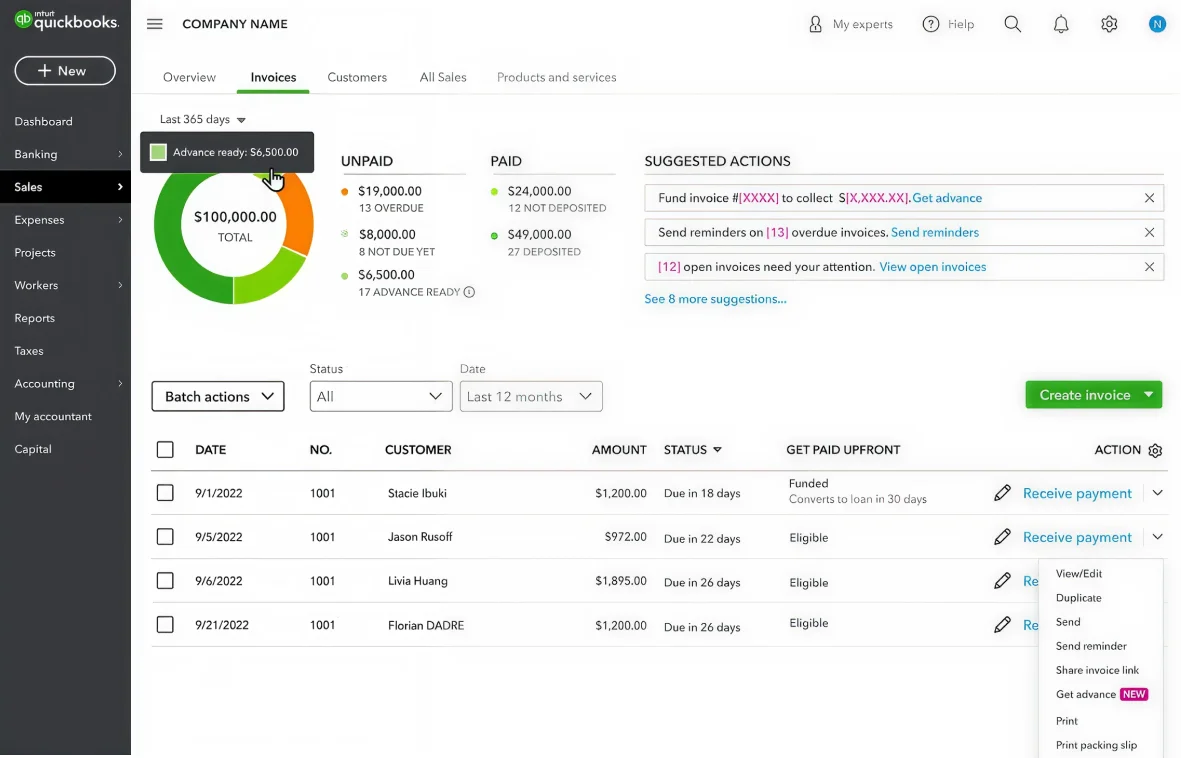
Dashboard data card: retelling the invoicing story
We re-tooled the data card to show data differently. The card now uses a consistent timeline, surfaces what matters (overdue, not-due, advance-ready), and gives customers tactical actions. A donut chart replaces the old bar visualization, breaking down invoice status and GPU eligibility in one view.

GPU status column: eligibility at a glance
To inform customers which invoices are eligible for Get Paid Upfront, we added a dedicated column with "Eligible" and "Funded" labels. It lives naturally alongside invoice status, making GPU feel like a core part of invoicing, not a separate product to learn.

Suggested actions: contextual discovery in the dropdown
When customers open an invoice's action dropdown, "Get advance" appears as a suggested option alongside Send reminder, Record payment, and more. Contextual discovery at the moment of intent, woven into existing workflow, not bolted on top.
Invoice detail banner: advance offer at the point of decision
A subtle banner at the top of the invoice detail view tells customers they're eligible for Get Paid Upfront. Informative, not aggressive, using the same visual language as the rest of the integration, so it feels native to QuickBooks.
What changed

- Data card showed generic paid/unpaid totals without clarity on what to do next
- No visibility into which invoices could be advanced
- Invoice home page hadn't evolved in years
- No quick actions—customers navigated into each invoice individually
- Inconsistent visual language between dashboard and invoice views
- Get Paid Upfront was invisible within the invoicing flow
- Donut chart + summary surfaces overdue, not-due, and advance-ready amounts
- Dedicated GPU column clearly shows eligibility per invoice
- Invoice home page fully redesigned with cohesive data visualization
- Suggested actions and contextual "Get advance" in action dropdown
- Consistent visual story from dashboard data card to invoice detail
- Get Paid Upfront feels like a natural part of invoicing
Result: Contextual placement drove a 340% increase in GPU discoverability. 28% of eligible customers engaged in month one, and time-to-discovery dropped by 14x compared to the previous standalone placement.
Measurable outcomes
Six months after launch, the feature reached 40% of eligible QuickBooks users. The data validated our design approach. Contextual discovery worked, and customers engaged with the feature at rates well above typical feature adoption benchmarks.
Beyond the metrics, qualitative feedback was consistently positive. Users reported that the feature reduced friction around cash flow management, and accountants appreciated eliminating the need to manually review eligibility across clients. The design's restraint—avoiding aggressive promotional language, built trust rather than skepticism.
What I'd carry forward
The instinct on a project like this is to surface the feature everywhere you can. We saw dozens of potential touchpoints and chose four. That restraint turned out to be the most important design decision we made, because contextual discovery builds trust and promotional saturation erodes it. The other thing that stuck with me is how much the copy mattered. "Get advance" versus "Fund invoice" versus "Get paid now" changed engagement more than layout changes did. Customers responded to action-oriented language that matched how they already thought about their invoicing workflow. And by keeping the same visual language, the donut chart, the progress bars, the color system, from dashboard to invoice detail, customers could build intuition at every level without us having to explain anything.