Internal Underwriting Tool for Financial Reviews
QuickBooks Capital's lending volume doubled in FY22, but over 60% of applications still required a human to review them. Underwriters were working weekends and holidays just to stay within a 2-day SLA, scrolling through a 17-tab Excel spreadsheet they called "the Checklist." The average time to decision had ballooned to 8.9 days. Customers were waiting, resubmitting documents, and dropping off.
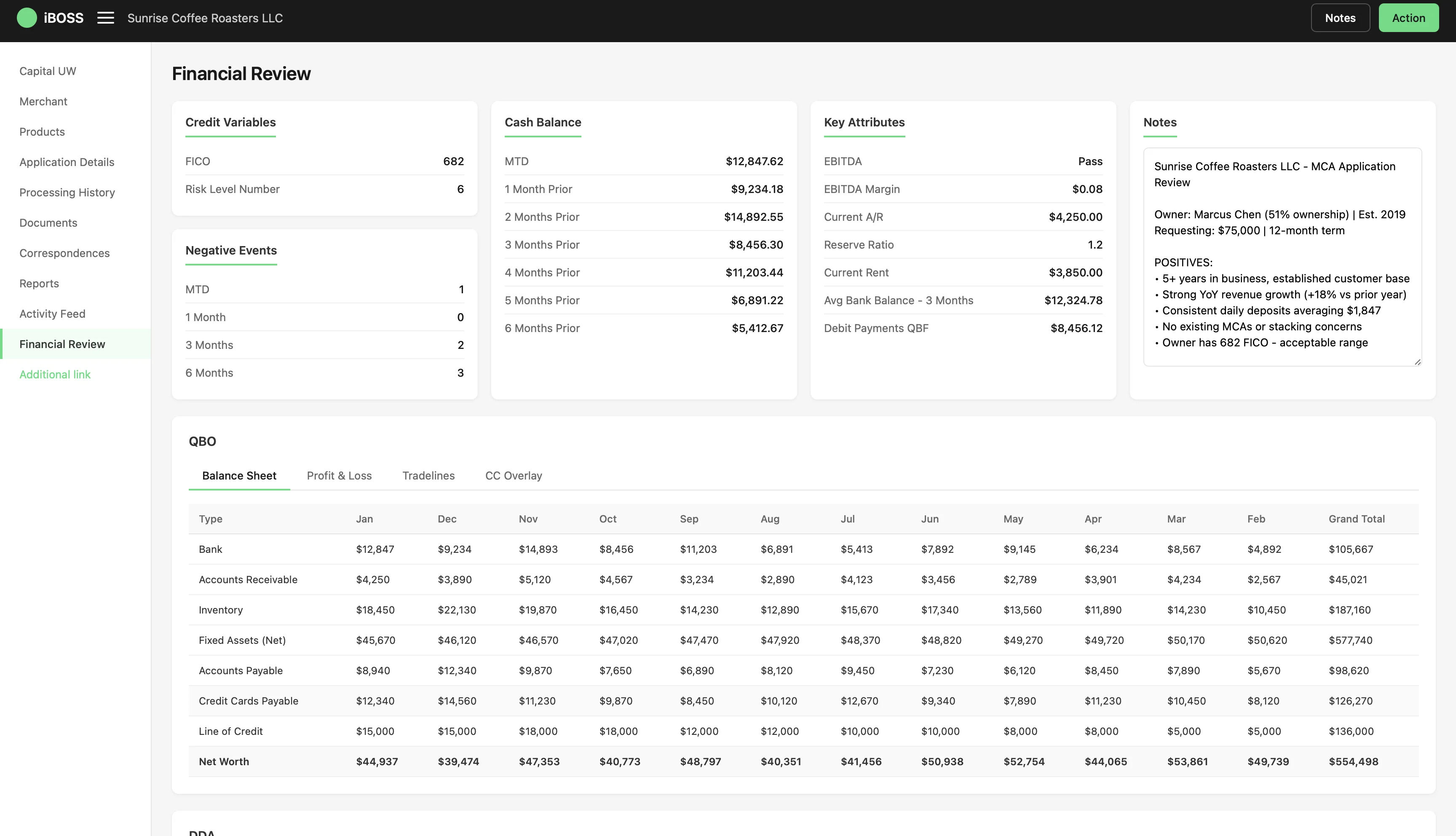
I designed iBOSS, a purpose-built underwriting tool that replaced that spreadsheet with a single-page review experience. It distilled 1,000+ data points down to fewer than 100, introduced an audit trail for every decision, and cut review time in half during pilot.
2 minute overview of the final product and key interactions
Dashboard overview
All critical data points, FICO, cash balance, EBITDA, negative events, and analyst notes, visible on a single screen. The 10-second gut check that used to take 15 minutes across 17 tabs.

Balance Sheet
12 months of QBO-connected financial data, bank balances, receivables, inventory, payables, and net worth), auto-populated and sortable without manual data entry.

Profit & Loss
Auto-generated P&L with expandable line items. Revenue, COGS, operating expenses, and EBITDA flow down to summary margin cards at the bottom.

Tradelines
Full credit picture at a glance. 8 tradelines, utilization bars, payment status badges, and 12-month payment history heatmaps for instant pattern recognition.

CC Overlay
Credit card transactions cross-referenced against QBO records to catch discrepancies and verify spending patterns match reported income.

DDA Bank Statements
Transactions grouped by payee: Square deposits, Stripe transfers, supplier payments, payroll, with monthly breakdowns across the full review period.

Month-to-Date View
Current month summary with total credits, debits, net change, and transaction count. Each transaction auto-tagged and compared to prior month trends.

Transaction Tagging
Revenue, Expense, and Fee tags color-coded for rapid scanning. Adjust toggles let underwriters include or exclude transactions from the final health calculation.

Final Health
DDA-derived data vs QBO data side by side: gross revenue, adjustments, net totals, and monthly averages. The source of truth for the lending decision.

Change Log
Full audit trail: who excluded a transaction, when, why, and the exact dollar impact; 4 adjustments, -$7,250 net impact, all traceable for compliance.

Interactive walkthrough of the full financial review flow
QuickBooks lending doubled, but the team couldn't keep up
Lending grew 2x compared to pre-pandemic levels in FY22, but 60%+ of loan applications still required manual review. The underwriting team was working overtime, including weekends and holidays, just to stay within their 2-day SLA. With originations expected to double again, the bottleneck was about to become a wall.
The average time for an underwriter to pick up an application ranged between 2–8 days. Time to Decision for manually reviewed apps averaged 8.9 days. Customers were waiting too long and submitting documents repeatedly.
End-to-end UX design, from discovery through hi-fi prototypes
I was the sole designer embedded on this initiative, partnering with a PM, engineering lead, and cross-functional stakeholders across underwriting, policy, and compliance.
A month inside the underwriting workflow
Our team spent a month deep-diving into the underwriter experience. We performed follow-me-home interviews, reviewed existing process documentation, and mapped the end-to-end underwriting journey. We identified the Financial Review—where analysts manually review 12 months of bank transaction data—as the most manual, time-consuming, and high-impact area to improve.
~30% of all applications require an underwriter to review 12 months of bank data. This process takes anywhere from a few minutes to an hour. The average: 20 minutes per review.
The existing tool was an Excel spreadsheet the team called "the "Checklist": over 1,000 data points across 17 tabs. Through 4 stakeholder discussions, a card sorting exercise, and 3 prototyping sessions with underwriting, policy, and compliance, we distilled those 1,000+ data points down to fewer than 100.

Card sorting exercise
We gave 6 underwriters a deck of 94 cards. Each representing a data point from the existing Checklist, and asked them to group them by how they actually use them during a review. The clusters that emerged directly shaped the tool's information architecture.
- FICO score
- Risk level number
- Cash balance (MTD + trends)
- EBITDA pass/fail
- Negative events (MTD, 3mo, 6mo)
- Balance sheet (monthly)
- Revenue, COGS, OpEx
- Gross profit & net income
- EBITDA breakdown
- Transaction-level debits & credits
- Payee groupings
- Revenue vs. expense tagging
- Monthly net change
- Open tradelines & balances
- Utilization rates
- Payment history (12 months)
- Delinquencies
- Processor connections (Square, Stripe, Clover)
- 6-month volume
- Transaction counts
- Avg transaction size
- Excluded transactions
- Manual additions
- Re-categorizations
- Final health summary
Mapping the underwriter's financial review
We mapped every step of the manual review process from opening the application to submitting the decision to identify pain points, redundant steps, and opportunities to surface the right data at the right time.
Interactive prototype. Scroll and zoom to explore the full journey map
Four guardrails for every decision
Before jumping into design, we established principles to guide priorities and tradeoffs throughout the project.
How underwriter feedback reshaped the layout
The first concept presented all transaction data in a flat table, mirroring the Excel mental model. After testing with three underwriters, we learned they scan by category first, not chronologically, so V2 introduced collapsible expense groups with summary cards, which matched their actual workflow.
Result: After switching from flat tables to collapsible expense groups, underwriters completed category-level review significantly faster in testing. The layout matched how they actually scan, not how the data was stored.
