Walmart Wireless
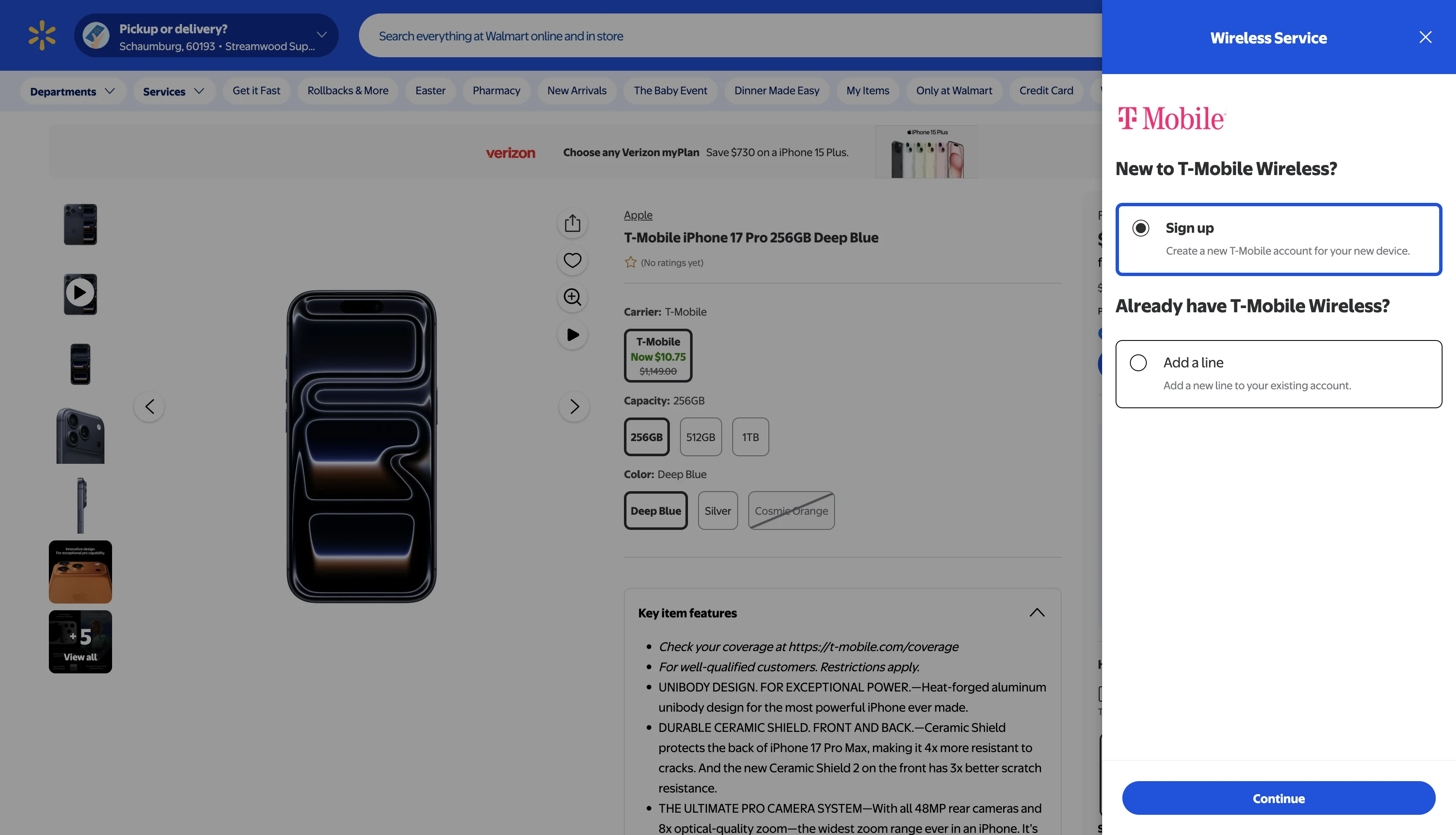
Buying a phone on Walmart.com meant clicking "Continue" and landing on a completely different website. The Walmart header disappeared, the styling changed, and the checkout flow stretched to 8+ minutes across three separate page redirects. 65% of customers dropped off at the handover. T-Mobile wasn’t available online at all, forcing customers into stores for a 30-minute activation process.
I redesigned the end-to-end wireless shopping experience around a drawer pattern that keeps customers on the product page from start to finish. Carrier selection, plan comparison, activation, and checkout all happen in one contained flow.
The Problem
T-Mobile only available in-store. No online option like Verizon and AT&T. 30+ minute activation process, massive missed opportunity.
The Opportunity
Bring all carriers online with a redesigned shopping experience with a modern, confidence-building, and applied across all carriers.
Online Walmart Cell Phone Purchasing
After selecting a phone, customers get redirected to what feels like a different website, Walmart styling disappears, navigation is gone, and trust erodes.
Click "Continue" and you're on a different website. Walmart header gone, styling shifted, 8+ minute carrier flow. This is where we lose 65% of customers.
The old flow redirected customers away from Walmart to a separate carrier portal
Where the experience breaks
Quantifying the Problem
We mapped friction points quantitatively to understand the business cost.
Goals
- Successfully integrate T-Mobile to Walmart.com to provide post-paid ship-to-home fulfillment option.
- Create a vision for what a new online shopping experience can be for all carriers within the Walmart platform.
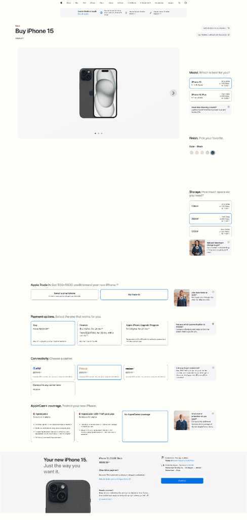
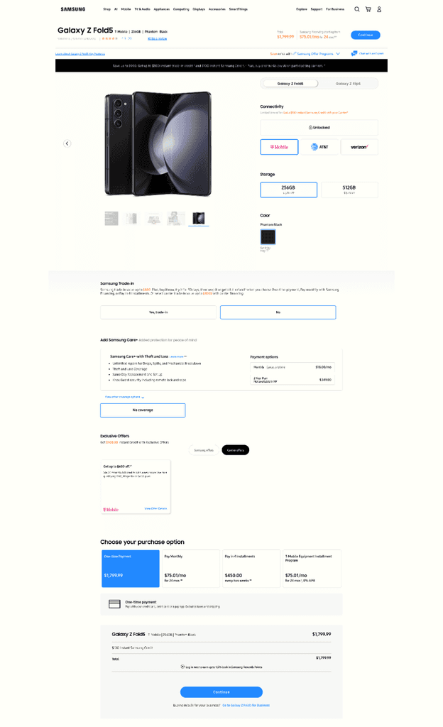
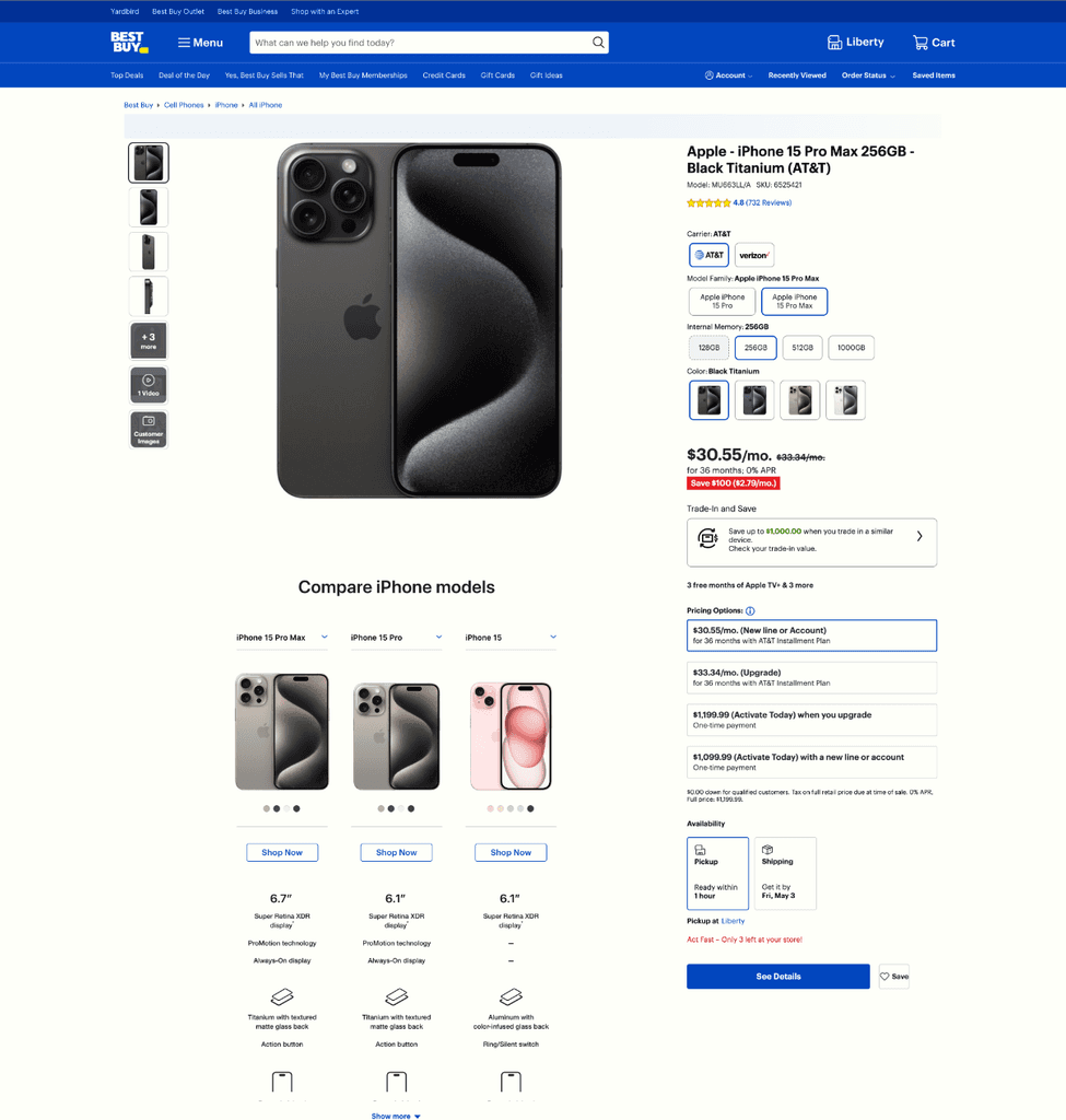
Competitive Analysis
Apple, Samsung, Best Buy, all used the same redirect pattern. So I looked at customization-heavy purchase experiences instead.
Guiding our design direction
Exploring three directions
Three iterations: two traditional refreshes, one radical departure. Leadership chose the third: a drawer pattern that was a major shift from the industry standard.
Traditional Refresh
Explored
Updated styling and component organization within the existing redirect pattern. Modernized the carrier flow UI but kept the multi-page structure.
Hybrid Approach
Explored
Partial integration where some steps happened in-context on Walmart and others redirected to the carrier. Mixed Walmart and carrier UI elements.
Drawer Pattern
Shipped
Full drawer-based shopping experience that slides up from the PDP. Customers configure phone, carrier, and plan without ever leaving the product page.
How we tested and iterated
Three rounds of progressively higher-fidelity testing before committing to engineering.
Key iteration from testing: Round 2 revealed that participants struggled to compare plans when carriers were shown sequentially. This directly led to Design Decision #2: the side-by-side carrier comparison view. Without usability testing, we would have shipped the original tabbed interface.
Key decisions that shaped the experience
Drawer Pattern for In-Context Shopping
Drawer slides up from the PDP—product stays visible while you configure your plan. Carrier selection, comparison, and checkout all in one contained flow.
Result: In testing, the drawer pattern eliminated the 65% drop-off at the carrier redirect entirely. Customers stayed within the Walmart context through the full checkout flow.
Transparent Carrier & Plan Comparison
Side-by-side comparison instead of sequential selection. Monthly cost, down payment, and total cost all visible upfront. No hidden pricing.
Result: Checkout time dropped from 8 minutes to 2.5 minutes. Side-by-side plan comparison reduced back-navigation significantly compared to the sequential selection model.
Progressive Disclosure on Mobile
64% of wireless searches are mobile. Drawer goes full-screen with step-by-step flow—one focused screen per step, native gestures.
The Complete Experience
Drawer opens with carrier selection, updates to show plans and transparent pricing. Activation, verification, and payment all happen in-context, ending with a standard Walmart order confirmation.
Click through the prototype to explore the wireless service flow
Mobile Experience
On mobile, the drawer goes full-screen, one focused step per screen, native to phone interaction.
Tap through the mobile prototype to see the full-screen drawer flow
What I owned vs. supported
Measurable outcomes
$5.4M projected annual GMV lift. Checkout time: 8 min → 2.5 min. Customer satisfaction in beta: 86%.
What I learned
Every competitor we studied used the same redirect pattern for wireless checkout. Apple, Samsung, Best Buy, they all sent customers to a separate carrier flow. Challenging that felt risky, and leadership initially pushed back on the drawer approach because it had no industry precedent. What sold it was the data: 65% of customers were abandoning at the redirect, and a $1,000+ phone purchase with a 2-year commitment needs more trust, not less. The other lesson was that carrier partner constraints weren’t blockers. They were design inputs. Each carrier had different API limitations and regulatory requirements, and working within those constraints actually produced a more modular architecture than if we’d had free rein. In the end, the 3.2x speed improvement mattered more than the $5.4M GMV headline, because respecting customers’ time is what drives the kind of loyalty that compounds.